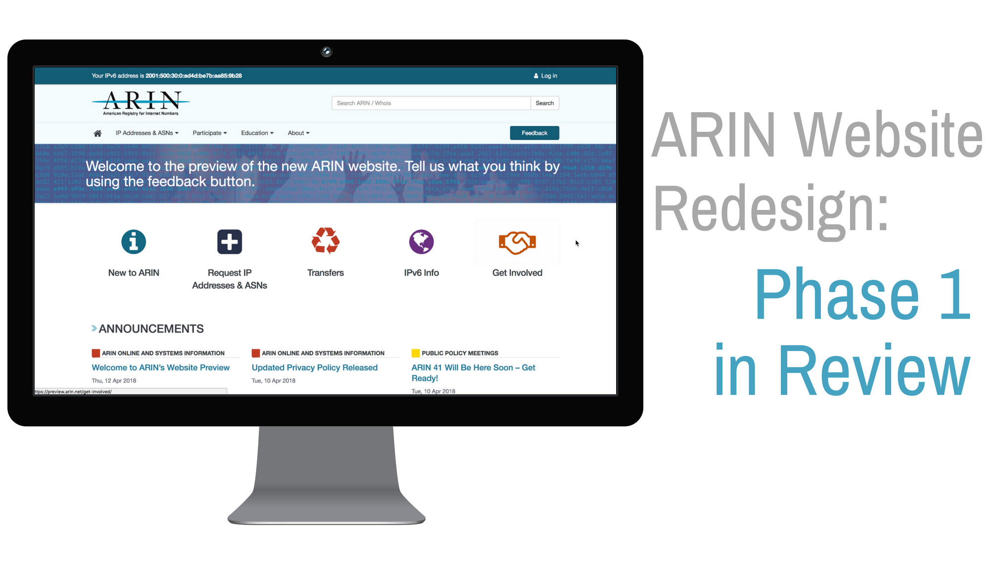
ARIN Website Redesign – Phase 1 in Review [Archived]
OUT OF DATE?
Here in the Vault, information is published in its final form and then not changed or updated. As a result, some content, specifically links to other pages and other references, may be out-of-date or no longer available.
Redesigning any website is no small feat, and ARIN’s website is no exception. The ramp up to our Phase 1 preview at ARIN 41 included a full site audit, creation of the ARIN Vault, card sorting exercises involving staff and community, and paper prototyping with volunteers at ARIN 40. We formed a special cross-department team involving communications, operations, software development and user experience. It has been a wild ride so far.
Next up will be testing options for ARIN Online integration with the new website.
But back to the preview, when we returned from ARIN 41 we spent some time reviewing the feedback we received online and in-person, as well as through our online tree test of our proposed navigation hierarchy. We received lots of great input that we have already put to use in shaping the next phases of our redesign effort.
Some Numbers
-
The Preview homepage received approximately 2500 total pageviews and 700 unique page views
-
Eleven ARIN 41 attendees sat for in-person user tests that lasted an average of 11 minutes
-
Thirty-eight individuals completed the feedback survey available through the preview site
-
One hundred twenty-four individuals started the navigation Tree Test; 72 completed the study, 52 abandoned – 14 of 27 questions were answered on average
-
Over 70% of respondents said they found the main menu either somewhat or very intuitive. Sub-categories got a similarly favorable rating with 52% saying they were very or extremely helpful. An additional 44% found them somewhat helpful.
-
When asked about the five “top task” items on the homepage, 65% of respondents found them to be extremely or very helpful. The main complaint was that they were not necessarily helpful to power users/frequent visitors.
Top Take Aways
In-person User Tests
Likes
-
In-person testers gave generally high marks to look and feel
-
Common descriptors were: clean, easy, organized
-
People like videos
Dislikes
-
A couple of testers at the Miami event, not unexpectedly, suggested Events could be higher on the home page
-
A few testers were resistant to scrolling
Preview Feedback Survey
-
We received 19 freeform comments on the navigation menu, including several items that have already been identified as stories for improvements:
-
Shortening the delay on the menu hover
-
Ordering and number of topics in the sub-menu
-
Changes to headings
-
-
Some actions under consideration:
-
Adding a Username and Password field for account login
-
Using a single color for announcements
-
Improvements to the top task graphics and labeling to make them more intuitive
-
Reorganizing the lower half of the page to reduce “clutter”
-
Updates to the top-level navigation and sub-menu
-
Improvements to the search box to make it more intuitive to use
-
Tree Test
-
Naming conventions, especially as applicable to page titles, should be reconsidered for clarity
-
Top-level navigation needs some modification, possible additions
-
Some issues in the test are resolved by the mega-menu and it’s presentation of related options in a single drop-down. We could not test exactly as the menu displays
-
Need landing pages for ASN and IPv4
-
IPv6 content should be consolidated
-
Users currently expect to find POC info under Manage Resources
-
Users currently expect to find Org Id info under Getting Started
-
Tester had no clear idea of where Membership info should be located
-
Expected Elections info under Participate not About
This is just a sampling of the kinds of great insights we received from our preview testers, and there will be more opportunities for the community to give feedback before we launch our new website!
Coming Soon
ARIN Online and www.arin.net integration options – help us shape your path from the website to the customer account application.
ARIN Website Preview Testing at ARIN 42 – Last looks! This will be the final opportunity for the community to provide feedback on the new website prior to launch in 2019!
OUT OF DATE?
Here in the Vault, information is published in its final form and then not changed or updated. As a result, some content, specifically links to other pages and other references, may be out-of-date or no longer available.
